CSS flowers
CSS offers lots of possibilities to make a design more appealing through transforms, transitions and animations. Transforms can be used to create some nice effects through translation, rotation and scaling. We can also use preprocessors to generate the CSS without typing the same rules over and over again, but this is more of a convenience, since only the CSS is going to be loaded by the browser. A good idea is to always try to minimize repetitions in the final CSS code. The bulk of those repetitions will often be related to browser prefixes. We shouldn’t forget that CSS is on the critical path, which means that having a large 40kB stylesheet will delay page rendering. There is also another way to have a similar effect to what a preprocessor does, without actually using it or having to install Ruby or third-party applications. A server-side language can help us generate both the elements and the styles we need for them. The trouble with this approach is that we can very easily mix content and presentation, which means that maintenance will become exponentially hard over time. But for doing something simple, it may still be a valid approach. We can generate the stylesheet rules with PHP and place them within the <style> tag, which is cleaner, but we’ll need then to keep track which style corresponds to which element, which can be tedious if our page has too many elements. We could also attach the styles directly to the elements, which is a bad practice, but still acceptable for simple experiments. In this case, we can omit prefixes, since we are interested only in the result in a single browser first.
Combining the generative power of a server-side language with the beauty of CSS shapes allows us to create some interesting “flowers”:
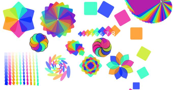
Every box is an individual DOM element that receives its proper styles through PHP (you may want to use something else). With a three-line loop we can instruct the browser to have as many elements as we want, but we should have enough distinctive styles in order to not bore the user. Too many styles can add noise on the page, so we should avoid that. If we use each element for visual purposes, it means that it should have visual value, e.g. a good portion of it should remain visible. Translation, rotation and scaling (heavily used in 3D packages as well) introduce interesting dynamics on the page, which can make it more engaging. Although each element is a box, we can still mold it in a variety of ways until we are happy with it. Viewing CSS as data allows us to seek ways to get the data we want in the iteration we want.
All effects seem to be nice, but only until they start to bother the user. (We assume that every good effect becomes boring after n views.) That something is possible doesn’t mean that it should be done. If we want to use such effects on a site that has a lot of traffic, we should be able to defend our decision. How valuable is this effect for the user? Is it helpful, explanatory, suggesting? What is the cost of this effect and what is overpowered by it? These are some good questions to ask ourselves before we add the next effect (or the library for it) on our site.
The more elements we need to achieve the desired visual result, the more costly its computation becomes. Each iteration consumes CPU and each DOM element consumes memory. An efficient result would be one that gets the desired effect with the least amount of computation. Sometimes, it can be hard to deal with large numbers of iterations and we may lose our sense of what exactly is going on. In this case, it helps to see how everything works with just a few iterations, and then gradually increase their number as long as we get correct results. If we can approximate the result we want with few iterations and the means of induction, we can be more confident that our results will be correct for a large number of elements too.
Experimenting with similar ideas (also: canvas!) can give us more interesting ones. For instance, it may not be easy to get a “difference” of two shapes, but we could partially achieve a similar effect if we blend the second shape with the background color of the page. What seems interesting to me (and I think that I’ve seen it before, possibly in a demoscene) is to create a 3D “path” of non-overlapping tiles, starting from the bottom of the screen, as if the user could walk on it, and then use a transition that will move this path in the direction towards the user when he clicks to “enter”.