Data analysis
Even if we have access to a lot of data, it becomes increasingly hard to make sense of it. Being able to analyze our current situation allows us to make informed decisions about our future, which can be useful no matter what our profession is. Data analysis is only one aspect of our work, and when isolated, it can't do much. But when combined with interdisciplinary know-how, it can support execution and at the same time depend on it. Every business has at least few key performance indicators that generate data, which needs to be analyzed in order to find if everyone is moving in the right direction. Accounting data is also of existential importance.
Everything around us is data even if we don't usually think so. Very often this fact remains hidden until otherwise. Sometimes data is like the air—it's there, but we can't see it. This is why it can be useful to think about the data behind every visible object—how it was made, what its origins are, who created it and under what kind of circumstances. It's often much easier for us to describe products through their quantifiable characteristics than it is to tell how we felt using them.
Eurostat is one of the many publishers of freely available data which everyone could take and analyze. Since inequality within the EU is a common theme these days, I decided to seek for signs whether it grows or shrinks and by how much. So I have taken part of the data in the dataset on GDP per capita, which is said to be the true measure of wealth in a society. I was only interested in the data of individual countries within the EU, so I discarded everything else. Unfortunately, the data was already normalized (numbers were relative to the average) and not raw as I wanted it to be. On the one side, this eliminates unneeded noise in the results, but on the other—it makes subsequent analysis harder. I was interested in the spread of the data, so I thought that the box plot would present it best. Before we continue, I want to make sure that you know what a box plot is and how it can be read.
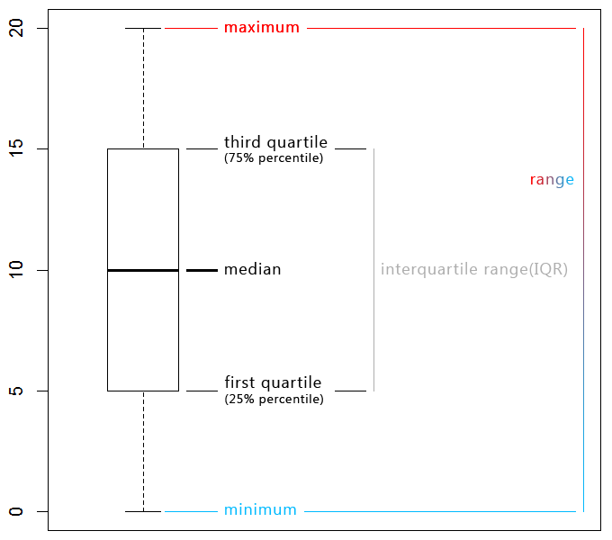
The box plot gives an overview of the distribution of data. As you can see it has two whiskers which denote the maximum and minimum. The difference between them is the range. The lower bound of the box is the first quartile and the upper bound the third quartile. The difference between them is the innerquartile range(IQR), which is a measure of the spread. In the center of box is the median, and not the mean(average). Here they are equal only for the sake of clarity. The mean is not resistant to extreme observations whereas the median is, which can give us less biased results. Even the trimmed mean(cutting the whiskers) is more robust than the mean in case of extremes. This diagram type is also useful to check for unusual observations.
Let's look at the data from Eurostat now. Side-by-side box plots can help us compare annual data and see how it changed over time.
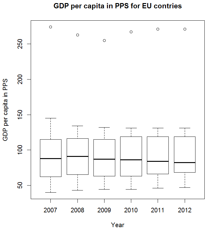
At the top we see dots, which are outliers—values that are so different compared to the rest that they don't fit the rules. We can see that since year 2008, the median value is constantly decreasing, which should indicate that countries as a whole have decreased their GDP per capita, even if they are measured against the same average of 100%. The maximums have declines, but only up to a point, whereas the minimums are constantly increasing since 2007, which means that the poorest countries seem to increase their GDP per capita. The first quartile seems to have moved up even stronger and is quickly closing the gap with the median. This could be a sign that inequality is slightly shrinking if we can trust the data.
What I've learned is that in some cases, choosing a logarithmic scale can help us see trends in the data more clearly. Linear regression allows us to understand the linear relationships between data. The correlation is captured in the line of “best fit”. Positive correlation (up to +1) indicates a strong relation between the data, negative correlation(down to -1) indicates lack of relationship. We can graph the residuals (differences between actual and predicted values) to analyze the data, but the result must be trend-free if we want to be correct in our conclusions.
It's best if we can collect data through experiments and only when it's not possible to prefer observation (we risk influencing the people we observe, which is also valid with web design). According to the central limit theorem, if we repeat an experiment over and over, the probabilities for the average result will converge to the normal distribution (whose data is consistent to the empirical rule), which decreases the amount of uncertainty in the results. Randomization is another technique that can be used in experiments in order to reduce bias or the inability to make conclusions. It is important for the selection of representative samples.